What is a box plot?
A box plot (aka box and whisker plot) uses boxes and lines to depict the distributions of one or more groups of numeric data. Box limits indicate the range of the central 50% of the data, with a central line marking the median value. Lines extend from each box to capture the range of the remaining data, with dots placed past the line edges to indicate outliers.1
The box and whiskers plot provides a cleaner representation of the general trend of the data, compared to the equivalent line chart.
When you should use a box plot?
Box plots are used to show distributions of numeric data values, especially when you want to compare them between multiple groups. They are built to provide high-level information at a glance, offering general information about a group of data’s symmetry, skew, variance, and outliers. It is easy to see where the main bulk of the data is, and make that comparison between different groups.
On the downside, a box plot’s simplicity also sets limitations on the density of data that it can show. With a box plot, we miss out on the ability to observe the detailed shape of distribution, such as if there are oddities in a distribution’s modality (number of ‘humps’ or peaks) and skew. 1
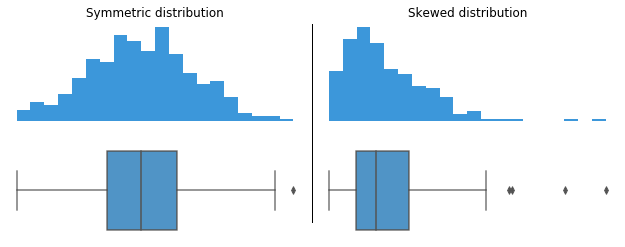
The datasets behind both histograms generate the same box plot in the center panel.
Interpreting a box and whiskers
- Q1: First quartile
- Q2: Second quartile or median
- Q3: Third quartile
- IQR: Q3 - Q1
- Lower whisker limit: Q1 - 1.5(IQR)
- Upper whisker limit: Q3 + 1.5(IQR)
Construction of a box plot is based around a dataset’s quartiles, or the values that divide the dataset into equal fourths. The first quartile (Q1) is greater than 25% of the data and less than the other 75%. The second quartile (Q2) sits in the middle, dividing the data in half. Q2 is also known as the median. The third quartile (Q3) is larger than 75% of the data, and smaller than the remaining 25%. In a box and whiskers plot, the ends of the box and its center line mark the locations of these three quartiles.
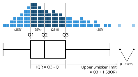
The distance between Q3 and Q1 is known as the interquartile range (IQR) and plays a major part in how long the whiskers extending from the box are. Each whisker extends to the furthest data point in each wing that is within 1.5 times the IQR. Any data point further than that distance is considered an outlier, and is marked with a dot. There are other ways of defining the whisker lengths, which are discussed below.
When a data distribution is symmetric, you can expect the median to be in the exact center of the box: the distance between Q1 and Q2 should be the same as between Q2 and Q3. Outliers should be evenly present on either side of the box. If a distribution is skewed, then the median will not be in the middle of the box, and instead off to the side. You may also find an imbalance in the whisker lengths, where one side is short with no outliers, and the other has a long tail with many more outliers.